Tuesday, 13 March 2012
WANTED: Slab Serif Typeface for Over Use
WANTED
Slab Serif Typeface for Over Use
Also known as Egyptian, Square Serif, Mechanical or Mécanes
I seem to be noticing a lot more Slab Serif typefaces in use these days, particularly in advertising, both in print and on the web, including this article. Their use is widespread on sale signs, promotions, company straplines and display headings. Not surprising, they were created as "Display Fonts" with their clean, bold lines and squared serifs. Being robust they are intended to draw attention to themselves. If you want your message to stand out on a page, it certainly will.
The advancement in mechanical printing and the need for large scale advertising saw the first Slab Serifs (or Egyptians) appearing way back in the early 1800s as well as the even heavier Fat Face fonts.
These are a few of my favourite things
Maybe I'm noticing them more because I've used them on a recent project and now, while working on a new brand which requires a bold and confident look, a Slab Serif fits the brief. There's certainly plenty to choose from and it is easy to spot one of the hundreds of Slab Serifs, old and new, in use everywhere.My personal choice has always been Rockwell. Designed in 1934, it's been around for a while and there are many older and newer, more contemporay popular Egyptians: From older typefaces like Clarendon (1845), ITC American Typewriter (1974), and more recently, the specially commisioned Guardian typeface (2005) and the extensive Soho with 40 faces! Just a few more of my favourite classic Egyptians.
Substance over style
I was taught that type should not be 'noticed', but 'read' and that the choice of type and typography should simply reflect and enhance the tone of what is being said.
Does a message lose its impact if the style of type is over used? Or am I just constantly bombarded with messages trying to get my attention? Possibly, most of the time this is true, so I guess the typeface has done its job and I'm probably numb to the actual words.
The choice is yours
However, there are of course many other Display fonts other than Slab Serifs that grab your attention by saying "Read This" and "Sale That". Once again though, it seems that I only notice the Slab Serifs. Am I just in a "Slab Serif mode" or are they in fashion at them moment? Many people use the wrong typeface for the wrong reason and say things such as, "I've seen this cool font on a poster, let's use that!" even if it's not fit for the purpose. I may be worried that if I use Rockwell or a similar font again some people will think I'm following a trend or just lazy - even if it works, and it will. Or maybe I'm just a type geek.
Typeset in Arvos by Anton Koovit
Images in order of appearance:
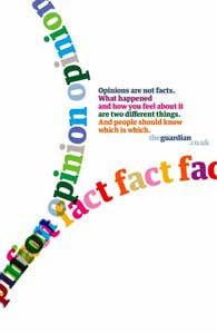
Guardian: Guardian.co.uk poster
Normande and Bodoni Ultra Bold Fat Face typeface
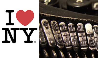
ITC American Typewriter, New York logo
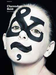
Clarendon: Fontface
Soho: GQ Magazine Cover
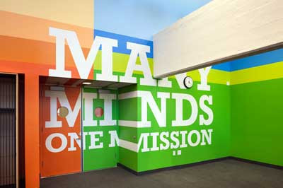
Rockwell: Achievement First Endeavor Middle School, Clinton Hill, Brooklyn
Rockwell: Poster
Sunday, 11 March 2012
Stage Two of New T Shirt Store is Over Here
Brand new specialist T shirt store is Over Here
Painting nearly done.
First batch of fitting acquired.
St Nicholas Market, Bristol
Opens 31st March 2012
Monday, 5 March 2012
New Specialist T Shirt Store is Over Here
Brand New Bristol T Shirt Store is Over Here.
Stage One completed!
Walls fitted.
Next: Underpaint the walls and get some cabinets...
Wall colour: Film Noir
There it is!


